Sunday, June 22, 2014

Visit to the MoMA

In the past year or two the MoMA has started to wear me out. It's not the crowds, I'm used to those, and it's not the exhibitions either, I love contemporary art and always like to see more. Rather, its the sense that I have that whatever is exhibited at the MoMA has gained that position primarily from the selling power of the artist or a particular dealer rather than the quality of the work by some other measure. I don't have another value system that the MoMA should use for exhibiting works, but still, it feels a bit culturally hegemonic. 

Below I have chosen two works from the collection, the first from design and the second from fine art. Both works have accrued a list of associations but the work from the designs section is thankfully, less political. 


From the design section I chose the Google Map Pin, designed by Jens Rasmussen in 2005, because I think it is a remarkable symbol. The Pin is barely reminiscent of real map pin, yet it functions so effectively, especially on a computer screen. There are so many ways in which the map pin works. It is first of all a pointer symbol, dwindling to a teardrop shape and consistent in size no matter the scale of the map, it seems to present of point of incredible exactitude. It seems to have pierced the earth at precisely the place we are looking for and, even as we zoom in, never looses confidence in its decision. The shape also lends itself to perspective. Whether the map is presented in perspective itself, which sometimes happens, or simply a birds-eye-view, the pin blossoms from the face of the earth. Sometimes I imagine myself on the surface looking up at an infinite red balloon. On that note, the pin does not only exert a downward force but floats upwards, just like someone at the chosen point was holding a large red balloon. Finally, the dot in the pin represents a target which happens to be floating over the earth. 


'To Lift' from 1967 by Richard Serra espouses the same sort of simple movements as the Map Pin above. It is part of a sort-of Analytical approach to the making of work and the title is simply the action Serra has applied to the chosen material.  Serra writes that he is not concerned with the results of the object only the process of making. That leaves us to be concerned with the output, in fact it is almost our duty when inside the museum. Serra's concern for 'simply' lifting (and also presumably placing  as the rubber did not immediately fall down) leaves room for other associations to swim into the picture. The lifted rubber is the reminiscent of papal cape that Serra has given himself. It shows the artist's ego and assertion of dominance by asking others to describe the object he has so thoughtlessly made. 

K&H: Folders, Stationary and More!

It was finally time to present our last project for the class and now I wonder how it went by so quickly. Along with past projects, we set up in the our studio room for an open house with other classes. Below is my little table with the collected good of Krater and Hohl. 

In total I made four different branded items: business cards, envelopes, a folder and an example of an invoice with letter head. I wanted to find diverse ways of presenting the company that stilled followed a consistent set of guidelines. By that I mean I wanted to make items that not only would look similar but also have an international corporate vibe and have something to do with holes. The folder and the business cards took the concept of holes more literally while the envelope and stationary are not as direct. Together I hope these objects give the idea of the mystical K&H brand.


This invoice has a hole graphic decoration inside of the colored boxy. I wanted it to
look a bit like that paper which you get paycheck on. Also you can see in the upper
right-hand corner that K&H is based in the beautiful tax have of the British Virgin Islands.

I considered doing a hole in the place address on the envelope, basically making
an address window. However, I chose not to. That approach seems simply like
the easy way out. I wanted a card that deal with negative space more subtly and
one that was playful within the confines of overwhelming corporate drabness. This
swoosh decoration is extremely bland and cliche -  but I hope self-consciously so.


This holes with the K, & and H were laser cut into the folder paper. The laser cutter
is great, I need to get one of my own.

Finally here are my letters from the much earlier text project. I laser cut Disclose out of a black card which worked very well. Although the kerning is not as precise as I would have hoped, I think they still good alright on the wall.

Monday, June 16, 2014

K&H business cards

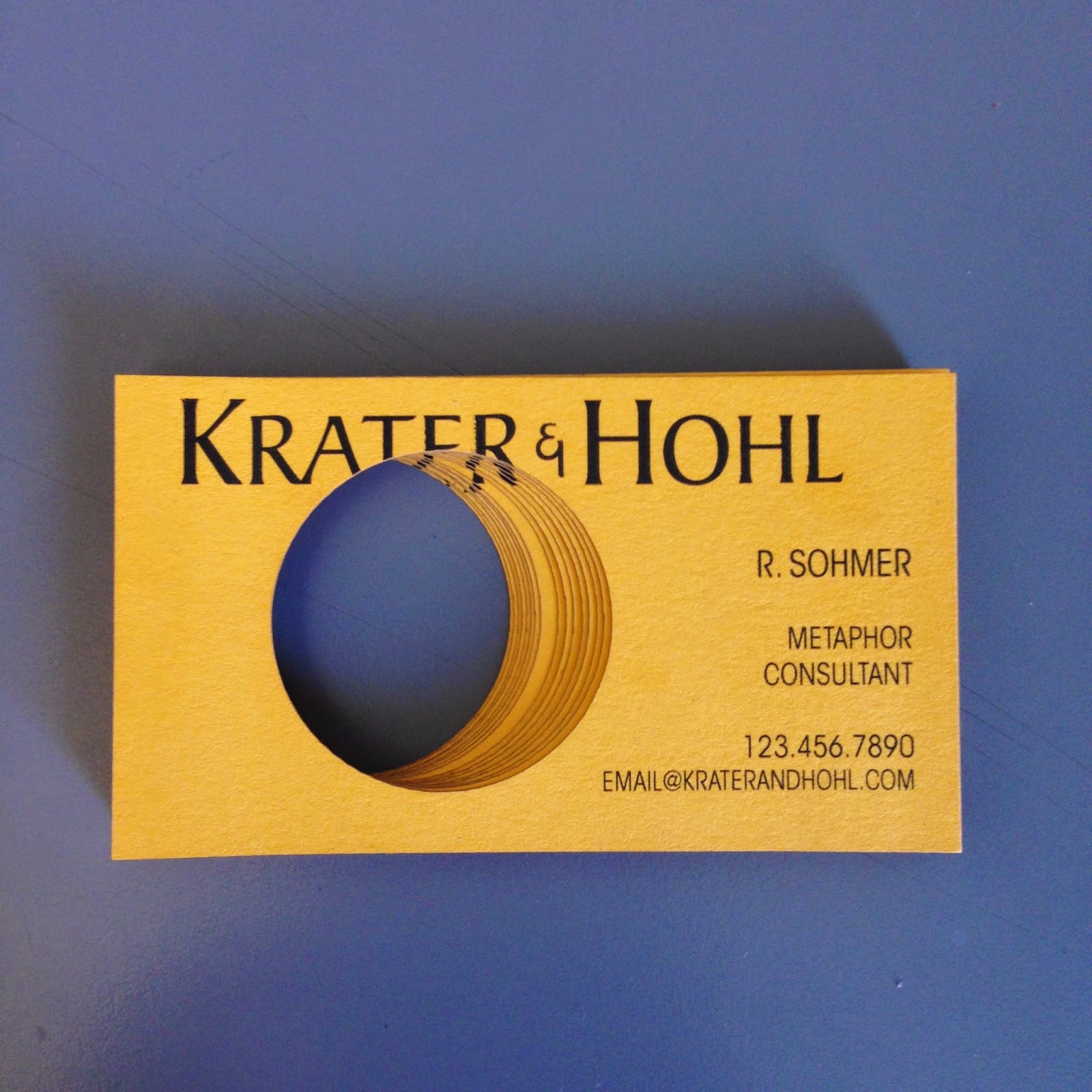
Today I just finished the business cards for Krater & Hohl. I am pretty happy with how they turned out. I printed them on a yellow card from Paper Presentation and it worked really well. I was worried that printing the yellow color would not be that consistent and I wanted the back to be the same. The yellow card handles the ink really well and was great in the laser cutter.

As is shown below, each card has a hole cut into it. I wanted a hole that was attention grabbing rather than simply a demonstration of what Krater & Hohl does. 


The holes for each card are different. Instead of a hole going straight down through the cards it goes at an angle. This doesn't matter if each card is by itself but I wanted the cards presented together to have a unique affect. 


Below is the difference between the top and bottom cards of the stack. Not a huge difference, but enough to create a sculptural effect.


Sunday, June 15, 2014

Working on the Krater&Hohl


I have been working on the logo for Krater & Hohl. After some messing around with the brush tool (presented below) I decided that using a previously designed typeface would be the best option for both the letterhead logo and the full printed name. I am using Baker Signet Std, which only comes in one weight. I had wanted to use a transitional typeface that both had the solidity of the construction business element and the formality of the consultation part of the company. 

The one symbol that I decided to design was the ampersand. I wanted something smaller than the traditional symbol and would work with the rest of the typeface. Presented here are some earlier versions before I decided on the final form. 

As spent a while messing around with the symbol of a hole and how to integrate it with the name of the company. The last of the three may be the strongest choice.


Here are some tests of possible colors. I think that the grey/black and the yellow are the best choice. Although there may be a place for blue.....


I worked out three possible business cards using different versions of the logo. In the first and second card space was cut out to create a hole. Between the letters in the first card inside the white circle in the second card. 

The class felt that the second card, the yellow one, was the most successful. However, there still might be space for the smaller logo on other company elements. 


Pattern work

While I was working on the logo and design elements for the Krater & Hole brand I created some patterns using a color scheme that I adopted from the CAT truck that was in the last post. I need to use a pattern in the final brand design but I'm not sure I will use any of these. Still, I enjoyed making them!


Brand and Logo influences


For Krater & Hohl I wanted to invent the brand for a company who I would never really create and certainly never work for. This is not because K&H is a conceptual company, based on a figure of speech - although that definitely affects its realization. I imagine K&H as a multinational corporation that is all practicalities without being heavy handed. It has the sort of behind-the-scenes professionalism of a company that is serious, reputable and also a bit mysterious. Just how the holes are made, or for that matter - why, is not relevant. K&H is a brand that is partially separated from product. It offers quality without dwelling on the nitty-gritty.

I expect that its consultants are the sort of white-gloved, low-voiced career people we meet you at your hotel, or maybe at the job site in a starched shirt and polarized sunglasses. The probably aren't very friendly.

So why do I want to create this sort of brand? Partly as a challenge, I want to make something interesting in the model of what I think of as pretty boring. But also I wanted to expand the concept of the hole, that of joining something that is both practical and a metaphor. K&H is not a little company, it doesn't make holes in someone's kitchen. Nor is it one whose activities, or products, could be easily described. This is a brand that is not straightforward, it hints at the vastness of the operation, the many fingers in many pots and the sort of semi-blankness which occurs when there is not a single face leading the brand but instead an institution that sustains itself. 

Because of this I have chosen a diverse group of brands as influences. Probably what connects them all is they are large and reputable enough to be institutions and they define the product rather than the other way round. (except Credit Suisse, what do they do? banking maybe?)

I wanted to have a construction component to K&H and I chose Caterpillar as a representative brand. Cat is very much on the practical equipment end but really dominates industry branding. The construction safety yellow is practically their branded color. Also I like this logo, instead of a hole, there is huge pile of yellow stuff in front of the letters.


This is a picture of a Cat truck. It's huge! I'm not sure how relevant it
is but I do like the colors.


I also chose National Geographic and only partly because of the great yellow border. National Geographic is the institutionalized magazine and makes us think of exploring new places. Also it gives you a connection to a brand, or something, that is outside of the magazine itself-  the National Geographic Society. What is the National Geographic Society? I remember receiving a membership card the first time I subscribed to NG but otherwise it seems to only exist to promote the magazine and its interests. 


Typically, I chose Google as another influence. Not because Google is such a mega-power but for the particular way in which their most famous tool works. A google search is a basic operation on the part of the consumer, you simply type whatever you want to search for into a small bar. But that simple operation is leads to some many possibilities. I want K&H to be similar  in that making a hole is a simple thing that leads you to think of all the possible ways you could take advantage of it.


Finally, I chose Credit Suisse. I am not sure I am a fan of these bank logos, the they are all surprisingly consistent, the text and small attached symbol. I do think I need to copy this style if I want some of the same connotations for Krater & Hohl. I chose Credit Suisse in particular because I am a big fan of these transitional type faces. 


Poster Design: Prototypes and the Final Version


Last week I posted about collecting the ideas for the music poster and now I wanted to show the prototypes and the final form. Below are two lino cut prints I did of possible versions of the poster. The intention for these was to translate the photographs into prints that then could be scanned and edited in Illustrator. 

I was working on turning the lines of light in the long-exposure print into graphic shapes and trying to present the buildings as if lit-up at night.


I enjoyed making these prints and I thought they turned out well. But when I scanned them and brought them into Illustrator they became problematic. The rough texture of the prints did not translate well into vectors and I spent a long time attempting to clean up the image. 

At this point I also decided on the colors and typeface for the poster. For the colors I chose hues that were similar to the 'urban night' photos I had collected. The neon blues, faded yellows and flashing reds were then manipulated to be richer and more stylized. I wanted a romanticized version of the city at night and I chose colors that related to the real-life example but were far more exaggerated. 

The same was true for the typeface. I chose Trajan because of its ancient Roman pretentions. The mix of historical reference and contemporary graphic creates a self-inflating image which I think fits with a glam rock band like Roxy Music. I also applied a 'wear' to the typeface by way of crumpling a laser printed page. I wanted to add even more tongue-in-cheek monumentality.


Eventually I realized that the scanned print was simply to messy and complex for the message that I wanted to convey. I redrew the poster with Illustrator tools and am much happier with the result.